
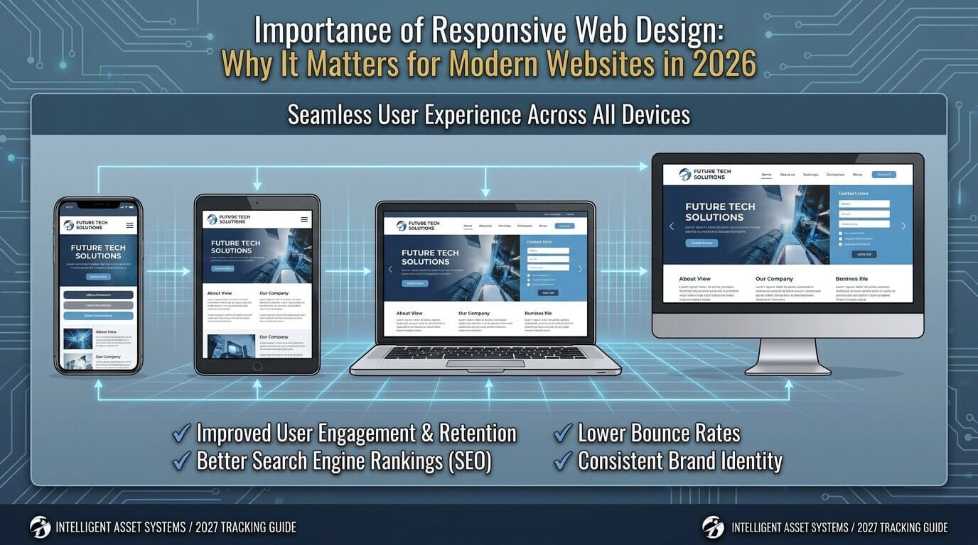
Have you ever opened a website on your phone and found yourself zooming in, scrolling sideways, or struggling to tap the right button? The information may be useful, but a poor mobile experience can make even a well-designed website frustrating to use.
That is why the importance of responsive web design goes far beyond making a website look good on a smartphone. Responsive design allows a website’s layout, images, navigation, text, and interactive elements to adapt to different screen sizes.
For businesses, bloggers, software companies, online stores, and service providers, this flexibility can make it easier for visitors to read content, navigate pages, complete forms, and take important actions.
If you’re planning a new website or improving an existing one, responsive design should be considered alongside your broader web development strategy.
Quick Answer: Why Is Responsive Web Design Important?
Responsive web design is important because it helps a website remain usable across smartphones, tablets, laptops, and desktops. It can improve navigation, readability, accessibility, maintenance, and the overall user experience. It also provides a stronger foundation for mobile-friendly SEO, performance optimization, and conversion-focused website design.
What Is Responsive Web Design?
Responsive web design is an approach to website development where a page adapts its layout and content to the available screen space.
Instead of creating a completely separate website for every device, developers use flexible layouts, CSS, responsive images, and media queries to allow the same website to adjust to different viewport sizes.
According to MDN’s responsive web design guidance, responsive design combines flexible layouts, modern CSS techniques, media queries, and other web-platform features to create interfaces that work across different devices.
For example, imagine a business website with three service cards.
On a desktop, they might appear like this:
Service A | Service B | Service C
On a smartphone, keeping all three cards side by side could make the text and buttons difficult to use. A responsive layout can stack the cards vertically:
Service A
Service B
Service C
The content stays the same, but its presentation changes to suit the available space.
Common technologies and techniques used in responsive web design include:
- CSS Grid
- Flexbox
- Media queries
- Flexible containers
- Relative units
- Responsive images
- Responsive typography
- Viewport configuration
Responsive Web Design vs. Mobile-Friendly Design
Responsive web design and mobile-friendly design are closely related, but they are not necessarily identical.
A mobile-friendly website is generally designed to work well on mobile devices. A responsive website uses flexible layouts and techniques that allow the interface to adapt as available space changes.
There is also a difference between responsive and adaptive design.
| Responsive Design | Adaptive Design |
|---|---|
| Layout adjusts to available space | Uses predefined layouts for particular conditions |
| Uses flexible components | Often switches between designed layouts |
| Can accommodate many viewport sizes | Usually targets specific ranges |
| One flexible experience | May use several distinct layouts |
For example, a responsive product grid might change from four columns to three, two, or one as the available width decreases.
The goal isn’t to create a separate design for every phone model. Instead, the layout should change when the content needs more or less space.
Why Is the Importance of Responsive Web Design So Significant?
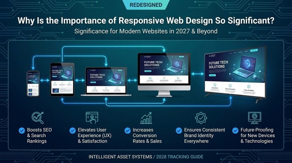
The importance of responsive web design comes from what happens after someone reaches your website.
Getting a visitor to a page is only part of the job. That visitor still needs to read the content, understand the offer, navigate the site, and complete whatever task brought them there.
Responsive design can support that experience in several important ways.
1. It Improves User Experience
A visitor shouldn’t need to pinch and zoom simply to read a headline or find a contact button.
A responsive website can make it easier to:
- Read text
- Navigate menus
- Tap buttons
- Complete forms
- View images
- Browse products
- Compare information
- Move between pages
Consider a local plumbing company.
Someone visiting from a desktop may want to explore several service pages. Someone arriving from a smartphone might simply want to call the business or request a quote.
If the Call Now button is difficult to find or tap on a phone, the website is creating unnecessary friction.
Responsive design helps the interface adapt so important actions remain usable.
2. It Supports a Better Mobile Search Experience
Responsive design is relevant to SEO because users can access websites from many different devices. However, it is important not to simplify this into “responsive design automatically improves rankings.”
Responsive design itself is not a ranking guarantee.
What it can provide is a more consistent foundation for a website that is easier to use and maintain across devices.
Consider someone searching for:
“website development cost”
They find your page through search and open it on a smartphone.
If the page contains tiny text, a table that extends beyond the screen, and a form that is difficult to complete, the visitor may struggle to get the information they came for.
Responsive design helps prevent those problems.
If you’re also planning a new website, our guide to website development costs explains some of the factors that can affect the overall development budget.
3. It Can Reduce Conversion Friction
Responsive design is particularly important for websites that depend on leads, registrations, bookings, or sales.
Think about the typical journey:
Visitor → Information → CTA → Form → Conversion
Problems anywhere along that path can create unnecessary friction.
For example, a marketing agency might have a six-field contact form that works perfectly with a mouse but becomes awkward on a smartphone.
A responsive implementation can reorganize the form so that:
- Fields stack vertically
- Labels remain readable
- Input areas are easy to tap
- Error messages remain visible
- The submit button is easy to find
This does not mean responsive design automatically increases conversions. It means the design is less likely to create avoidable usability problems.
4. It Simplifies Website Maintenance
Responsive design can also make ongoing website management more straightforward.
Instead of maintaining separate desktop and mobile versions, a responsive website generally uses one website structure that adapts to different screen sizes.
That can simplify:
- Content updates
- Design changes
- Bug fixes
- Testing
- Template management
Imagine updating a pricing page.
With a well-structured responsive website, you generally update the underlying content once and then ensure it displays correctly at different screen sizes.
That doesn’t eliminate maintenance. Websites still require security updates, content changes, technical monitoring, and testing. But responsive development can reduce unnecessary duplication.
5. It Supports Accessibility
Responsive design and accessibility are related, but responsive design alone does not make a website accessible.
One important accessibility consideration is reflow. W3C’s WCAG guidance explains that content should generally be able to reflow without loss of information or functionality and without requiring two-dimensional scrolling, subject to specific exceptions.
This matters when visitors enlarge text or use smaller viewing areas.
For example, increasing text size should not turn an otherwise readable article into a page where every sentence requires horizontal scrolling.
Other accessibility considerations include:
- Keyboard navigation
- Visible focus states
- Sufficient colour contrast
- Readable typography
- Accessible forms
- Logical content structure
- Appropriate touch targets
- Meaningful HTML
Responsive design should therefore be part of a wider web accessibility strategy.
6. It Maintains a Consistent Brand Experience
Your website shouldn’t feel like a completely different product when someone switches from a laptop to a phone.
Responsive layouts can help preserve:
- Branding
- Typography
- Colours
- Navigation
- Visual hierarchy
- Calls to action
- Content structure
For example, a software company might display three pricing plans side by side on desktop.
On mobile, those plans could become vertically stacked cards.
The layout changes, but the brand, pricing information, and conversion path remain consistent.
7. It Can Support Better Performance
Responsive design and website performance are connected, but they are not the same thing.
A responsive website can still be slow.
One common issue is sending unnecessarily large images to smaller screens. Responsive image techniques allow browsers to select more appropriate image resources for different situations.
Performance also depends on:
- Image optimization
- JavaScript
- CSS
- Fonts
- Third-party scripts
- Server response time
- Caching
- Hosting
- Content delivery
So avoid the claim that “responsive websites are always faster.”
A better conclusion is that responsive development should be combined with proper performance optimization.
8. It Helps Websites Adapt to Different Devices
Visitors don’t all use the same screen.
A website may be opened on:
- Smartphones
- Tablets
- Laptops
- Desktop monitors
- Resized browser windows
- Portrait displays
- Landscape displays
Responsive design provides a way to handle this variety without creating a separate pixel-perfect layout for every device.
That flexibility is one of the main reasons responsive web design remains an important part of modern website development.
What Happens When a Website Isn’t Responsive?
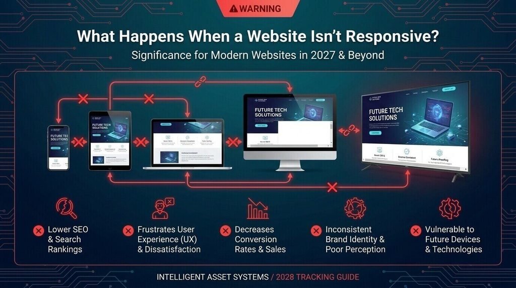
A website doesn’t have to be completely broken to create a poor mobile experience.
Small problems can quickly become frustrating.
Common issues include:
- Horizontal scrolling
- Tiny text
- Overlapping elements
- Images extending beyond the page
- Difficult navigation
- Unusable forms
- Small tap targets
- Hidden content
- Poorly structured tables
- Pop-ups that cover the entire screen
A Practical Example
Imagine an accounting firm’s desktop website.
Its navigation looks like this:
About | Services | Pricing | Resources | Contact
On a desktop, everything fits comfortably.
On a narrow smartphone screen, however, the menu may wrap awkwardly or extend beyond the viewport.
A responsive design could replace the desktop navigation with a compact mobile menu while keeping the same pages accessible.
The goal isn’t to remove useful content. It’s to present that content in a format that works within the available space.
How Does Responsive Web Design Work?
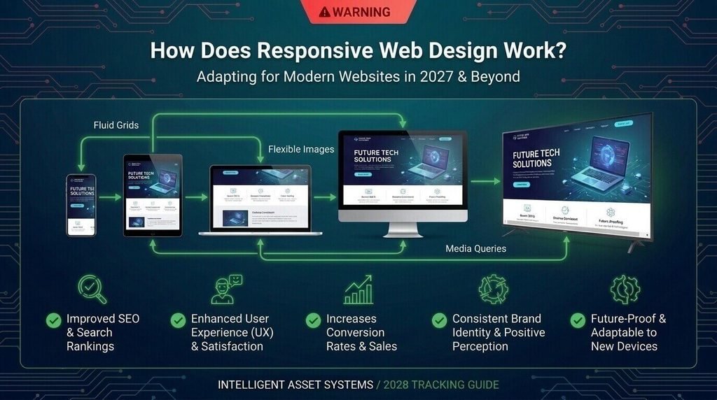
Responsive design isn’t a single feature that developers turn on. It combines several techniques.
Flexible Layouts
CSS Grid and Flexbox allow developers to build layouts that can expand, shrink, wrap, and rearrange based on available space.
For example, a four-column desktop layout might become a two-column tablet layout and a single-column mobile layout.
Media Queries
CSS media queries allow developers to apply different styles when specific conditions are met, such as viewport width or orientation. MDN’s media query documentation explains how media queries can be used to create layouts that respond to different viewport sizes.
A developer can use them to change:
- Column structure
- Navigation
- Spacing
- Typography
- Visibility
- Component arrangement
Importantly, breakpoints should generally be chosen based on where the content needs to change, not simply because a particular phone model exists.
Responsive Images
Images also need to adapt.
A large desktop image may be unnecessarily expensive to load on a small screen. Responsive image techniques can provide different resources depending on the display conditions.
For example, HTML’s srcset and sizes features can help a browser select an appropriate image resource for the available layout size.
Mobile-First Design
Mobile-first web design begins with the constraints of smaller screens and then adds enhancements as more space becomes available.
For example:
Mobile:
One-column layout → simplified navigation → stacked content
Tablet:
Expanded layout → additional columns
Desktop:
Wider content areas → multi-column sections → full navigation
MDN describes mobile-first responsive design as starting with the smallest view and progressively adding layout for larger screens.
Mobile-first development can be a useful strategy, but it is not synonymous with responsive design. Responsive design describes the adaptable behavior; mobile-first describes one approach to developing that experience.
How Responsive Design Benefits Different Types of Websites
The priorities vary depending on what your website is designed to accomplish.
| Website Type | Important Responsive Considerations |
|---|---|
| E-commerce | Product grids, filters, cart, checkout |
| Local business | Phone buttons, forms, directions, services |
| SaaS | Pricing, sign-up forms, dashboards |
| Blog | Typography, images, tables, reading width |
| B2B | Lead forms, case studies, navigation |
| Portfolio | Project images, galleries, contact details |
| Content/news | Reading experience, media, navigation |
E-commerce Example
An online clothing store might display 12 products in four columns on desktop.
That arrangement may become too cramped on a phone.
A responsive layout can reduce the number of columns so product images, names, prices, and buttons remain usable.
Local Business Example
A restaurant website may have visitors looking for only a few things:
- Opening hours
- Menu
- Location
- Phone number
- Booking information
These actions should be easy to find from a smartphone.
A beautiful desktop design is less useful if mobile visitors have to hunt for the information they need.
SaaS Example
A software company may use a large pricing comparison table on desktop.
On a phone, that same table may require excessive horizontal scrolling.
A responsive approach can reorganize the information into stacked pricing cards or another format that makes comparisons easier.
How to Check If Your Website Is Responsive
You can identify many responsive problems without being a developer.
Responsive Website Audit Checklist
Ask these questions:
- Can I read the main text without zooming?
- Does the page avoid unnecessary horizontal scrolling?
- Does the navigation work on small screens?
- Are buttons easy to tap?
- Do images stay inside their containers?
- Do videos resize correctly?
- Do forms remain usable?
- Are input fields and labels readable?
- Are important calls to action easy to find?
- Does the design work in portrait and landscape?
- Are tables still understandable?
- Do pop-ups fit the screen?
- Does the website work at different browser widths?
- Does important content remain available when the layout changes?
Browser developer tools can help simulate different viewport sizes. MDN also recommends testing responsive designs at multiple screen sizes.
Don’t test only the homepage.
Check the pages that matter most to your visitors:
- Product pages
- Service pages
- Contact forms
- Checkout
- Pricing
- Blog posts
- Search
- Navigation
- Account pages
Responsive Web Design Best Practices
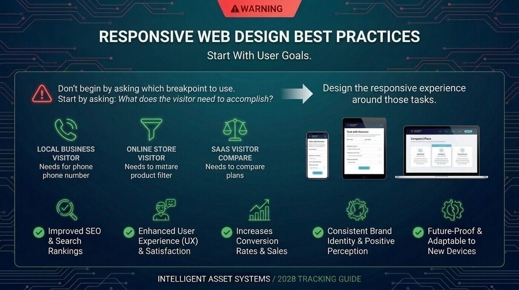
Start With User Goals
Don’t begin by asking which breakpoint to use.
Start by asking:
What does the visitor need to accomplish?
A local business visitor may need a phone number. An online store visitor may need a product filter. A SaaS visitor may need to compare plans.
Design the responsive experience around those tasks.
Let Content Determine Breakpoints
Don’t create breakpoints simply because a device is popular.
Instead, change the layout when the content becomes difficult to read or use.
This approach makes the design more adaptable to screen sizes that didn’t exist when the site was originally built.
Avoid Unnecessary Fixed-Width Elements
Fixed-width elements can create horizontal scrolling on narrow screens.
Flexible containers and modern CSS layout techniques can help the page adapt more naturally.
Make Images Responsive
Don’t allow large images to overflow their containers.
Also consider whether visitors need the largest available image resource on every device.
Design Mobile-Friendly Forms
Forms are often where responsive problems become obvious.
Check:
- Field spacing
- Label visibility
- Input size
- Error messages
- Keyboard behavior
- Submit buttons
Keep Mobile Navigation Simple
Don’t try to squeeze a desktop navigation bar into a tiny screen.
Prioritize the most important destinations and use a navigation pattern that works comfortably on touch devices.
Test Real User Journeys
Testing only whether the page “looks okay” isn’t enough.
Try completing actual tasks:
Find a product → Add it to cart → Start checkout
or:
Find a service → Read the details → Request a quote
If those journeys are difficult on mobile, the responsive implementation needs more work.
Common Responsive Web Design Mistakes
Even a website described as “responsive” can have usability problems.
Designing for Only One Screen Size
A site that looks good at one phone width can still break at another.
Making Buttons Too Small
Links and controls need enough space to interact with comfortably.
Hiding Important Content
Reducing clutter is useful, but removing information that visitors need can create a poor experience.
Using Oversized Images
Large image resources can waste bandwidth when smaller resources would be sufficient.
Ignoring Forms
Forms should be tested just as carefully as navigation and page layouts.
Assuming Responsive Means Accessible
Responsive layouts support accessibility, but accessibility requires additional design and development work.
Assuming Responsive Means Fast
Speed depends on many technical factors beyond layout.
Testing Only the Homepage
A responsive homepage does not prove that your checkout, pricing page, blog, forms, or product pages work properly.
When Should You Redesign an Existing Website?
Not every responsive problem requires a complete website rebuild.
You may need more substantial work if your website regularly has:
- Horizontal scrolling
- Broken mobile navigation
- Unreadable text
- Overlapping components
- Unusable forms
- Missing mobile functionality
- Outdated templates
- Difficult-to-maintain layouts
- Separate mobile and desktop experiences
- Major problems across important user journeys
Depending on the site, the solution could be:
Targeted CSS fixes → Component redesign → Responsive retrofit → Full website redesign
The appropriate option depends on your CMS, codebase, templates, integrations, content, traffic, and business requirements.
If you’re planning a larger project, those factors should also be considered when estimating website development cost.
How Much Does Responsive Web Design Cost?
There isn’t a single price for responsive web design.
The cost depends on the scope of the work.
Important factors include:
- Website size
- Number of templates
- Existing code quality
- CMS or framework
- E-commerce functionality
- Custom integrations
- Design complexity
- Accessibility requirements
- Content migration
- Testing
- Whether you’re improving an existing site or rebuilding it
For example, making a simple five-page business website responsive is a very different project from rebuilding a large e-commerce website with hundreds of product templates and a complex checkout.
For that reason, businesses should evaluate the existing website before relying on a generic responsive-design price.
How to Choose the Right Responsive Web Development Approach
If you’re hiring a developer or agency, ask questions that reveal how the work will actually be handled.
Ask About the Existing Website
- What currently breaks on mobile?
- Is the existing layout responsive?
- Are there fixed-width components?
- Are separate mobile templates being used?
- Is the CMS or theme outdated?
- Which pages create the biggest usability problems?
Ask About Testing
Find out whether the project includes testing across:
- Different viewport widths
- Smartphones
- Tablets
- Landscape orientation
- Forms
- Navigation
- Interactive elements
- Accessibility
- Performance
Ask About User Journeys
Don’t focus only on whether the homepage looks good.
Ask the developer to test the actions that matter to your business.
For example:
Lead-generation site:
Find service → Read information → Submit enquiry
E-commerce site:
Find product → Filter products → Add to cart → Checkout
SaaS site:
Compare plans → Select plan → Create account
This approach reveals practical problems that a screenshot can hide.
Frequently Asked Questions
Why is responsive web design important?
Responsive web design is important because it helps websites remain usable across different screen sizes. It can improve readability, navigation, accessibility, maintenance, and mobile usability while providing a more consistent experience across smartphones, tablets, laptops, and desktops.
Does responsive web design improve SEO?
Responsive design can support a search-friendly website by creating a consistent experience across devices, but it does not guarantee higher rankings. SEO also depends on content quality, technical SEO, performance, relevance, links, accessibility, and many other factors.
Is responsive design the same as mobile-friendly design?
Not exactly. Mobile-friendly generally means a website is usable on mobile devices, while responsive design describes an approach where the layout adapts to available screen space. A responsive website can therefore accommodate a broader range of viewport sizes.
How does responsive design improve user experience?
It allows layouts, navigation, images, forms, and other elements to adapt to available space. This can reduce problems such as tiny text, horizontal scrolling, cramped controls, and difficult navigation.
How can I tell if my website is responsive?
Resize your browser and test different screen widths. Look for horizontal scrolling, overlapping content, tiny text, broken images, difficult navigation, and unusable forms. Browser developer tools can also simulate different viewport sizes.
Does responsive design make a website faster?
Not automatically. Responsive development can support efficient image and layout strategies, but performance also depends on hosting, server response, JavaScript, CSS, images, fonts, caching, and third-party scripts.
Is responsive design important for small businesses?
Yes. Small-business websites often rely on visitors calling, requesting quotes, finding locations, booking services, or contacting the business. A responsive design helps keep those actions accessible across different devices.
Can an existing website be made responsive?
Often, yes. The amount of work depends on the existing code, CMS, theme, templates, plugins, integrations, and layout. Some websites need targeted improvements, while older or heavily customized websites may benefit from a broader redesign.
Conclusion: Why Responsive Design Matters
The importance of responsive web design comes down to a simple principle: your website should remain useful when the screen changes.
Visitors shouldn’t have to zoom into text, scroll sideways, fight with navigation, or struggle to complete a form because they’re using a smartphone.
Responsive design can support:
- Better user experience
- Improved mobile usability
- More accessible layouts
- Easier website maintenance
- Better cross-device consistency
- A stronger foundation for performance and SEO
- Smoother conversion journeys
But responsive design isn’t a magic switch.
A strong website also needs clear content, accessible interactions, sensible navigation, optimized images, good performance, and proper testing.
If your website looks good on desktop but becomes difficult to use on mobile, start with a practical audit. Identify the pages and user journeys causing the most friction, fix the highest-impact problems first, and then determine whether targeted improvements or a complete redesign makes more sense.
That approach gives visitors a better experience and gives your website a stronger foundation for long-term growth.